This review will be a big one because we’re comparing two of the most popular smartphone software updates released in 2021.
I’m talking about Google’s Android 12 update and Apple’s IOS 15 update. Both got announced around the same time, and I feel like we can learn a lot by comparing the two.
We’ll discover which features IOS 15 implemented that Android doesn’t have and vice versa. We’ll also see which features were copied and similar features that both software’s released.
Now, these updates are massive and have hundreds of changes. So, I won’t be able to compare everything, but it will still be a very detailed comparison.
Android 12 has been available to download a few months longer than IOS 15 has. Google released Android 12 back in February with a developer preview update for the pixels.

Just last month with Google, the company gave us a much better idea of the result. They even provided us with a timeline as to when we should expect the software to be stable sometime in august 2021.
On the other hand, Apple introduced IOS 15 just last week and released the first developer beta update. For anyone with an apple developer account to try out, the beta testing phase should last throughout the summer. I’m sure the public rollout date will occur around the same time that the new iPhones get released.
Now Google’s main focus with Android 12 is to make the UI a bit more personal. They’re changing the look of almost everything. I’ll go into more detail later on. Still, so far, they’ve modified the look of the lock screen, notification panel, quick settings, system settings, throwing in some new animations, and even supporting dynamic themes.
Of course, there are other things they’ve improved and changed. Still, my biggest takeaway about Android 12 is that it’s now more exciting, colorful, and playful, making IOS look dull and outdated.
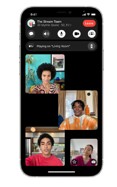
In contrast, Apple focused more on improving its UI and apps. For example, Facetime will allow you to listen to music or watch the video with your friends who aren’t in the same area as you. You’ll be able to Facetime your android buddies.
You also have much better control over what notifications or contacts can interrupt you. When you’re busy, and apps like safari, maps, imessage, weather, etc., have all been improved in one way or another.
So there’s a huge difference in what google and apple are trying to accomplish with their major OS update.
Let’s go over what exclusive features each interface has that the other doesn’t.
Starting with Apple IOS 15
I enjoyed how they improved the notifications even when they can be better managed than those found on android 12.
One of my biggest annoyances is constantly getting interrupted by unimportant notifications.
It usually breaks my concentration when I’m doing something or brings up my hopes for no reason when I’m waiting for a text from a friend.
IOS 15 tries to solve that in two ways; the first is through notification summary IOS will automatically figure out which notifications are unimportant.
Since you rarely open them, they’ll show you them in batches at a more appropriate time, such as in the morning or evening. That way, you are only alerted by apps or contacts that you truly care about right away. Another way you can manage your notifications is through a new tool that is now tied to ios existing do not disturb mode.

It’s called the focus. When you enable one of these modes, all your notifications will be silenced, except for the apps or contacts you choose to allow. You can even choose only to show a few of your home screen app pages. At the same time, the rest are hidden until the mode is turned off.
I thought it was pretty cool in my case.
When I’m working, I can only allow a few important contacts and maybe the Gmail or messages app to interrupt me.
When I’m sleeping, I don’t want any app to interrupt me, just a few important contacts. Such as any family members or close friends in case of an emergency.
I even created a custom one called favor apps only, which allows important notifications to ding me. Such as messaging apps, calendars, events, Twitter, etc.
In contrast, everything else, like games or random apps, is silenced. When you’re on focus mode, I thought it was cool that anyone who tries to message you will be notified that you’re on focus mode and that their message will not make any noise. However, they can still choose to bypass it and alert you forcibly.
Anyways if they deem the message to be urgent, it’s very similar to what slack does. Android notifications don’t have anything to this extent. I ended up using a third-party app called Datewise to get that same functionality, and it sucks too because they charge a subscription fee for this feature.
Another IOS 15 feature that I wish Android had is the ability to drag and drop data across apps. For example, if I’m in the photos app and I want to share a photo with another app, I can simply long-press on any image or video and then use a second finger to swipe out of the app;
then I can open another one and let go of the file to drop it in.
It works with any text images, zip files, audio videos, anything on the pixels.
You can select and copy text within the recent menu and paste the text into other apps, but that’s it imessage is on a whole different level when compared to the Android messages app.
Everyone already knows this. That’s not to say that android messages haven’t gotten better though with RCS messaging, but now Apple has improved imessage in two significant ways.
First, when you send multiple photos at once, imessage will now stack them on top of each other, or they’ll appear as a glanceable collage, so that way you don’t have a long list of individual photos, saves you the hassle of scrolling.
Secondly, whenever a friend shares a photo, article, music, podcast, or a link with you, that content will automatically appear within the relevant app in a new section called shared with you.
It makes it easier to keep track of the music or articles that your friends share. Apple wallet is now also a step ahead of other android payment apps such as google pay or Samsung pay.
They just announced that on top of being able to store your credit cards, it’d also allow you to store your digital keys to your hotel house or vehicles, and what impressed me is that it’ll even let you scan your ID in selected states. When you’re at the airport, TSA will allow for this digital id verification method.
So in the right circumstances, you can walk out of the house without your wallet or keys. On the other hand, Google is planning to support digital car keys within android auto, but that’s about it. Another exclusive IOS 15 change that I thought was extremely underrated is called hide my email. Essentially, whenever you’re filling out a form or signing up for a newsletter, that asks for your email.
Hide my email will allow you to generate a fake email address. Any incoming emails you receive from that newsletter or service you signed up for will get forwarded to your inbox.
This is very useful because if the newsletter or storefront begins to send you to spam randomly, then you can quickly burn that fake email address to stop them. In addition, it saves you from having to jump through a ton of hoops to unsubscribe from their newsletter.
It’s a feature that’s also built into ML, safari, and iCloud. Unfortunately, the search functionality on most stock android launchers is far behind IOS’S spotlight feature, especially on the pixel launcher. I usually install a third-party launcher with sesame integration to get a universal search bar in IOS 15. However, you can now search for photos by location, people, scenes, or even objects.
It can also find text and handwriting in your photos when you search for specific keywords. When you search for actors, musicians, TV shows, or movie spotlight, top it off.
Now quickly provides enhanced results that provide a ton of information and fashionably. My favorite feature that I wish Android had is the ability to search for apps that you don’t have installed and then quickly install them from the app store without leaving the spotlight.
Now that’s the next level finally, the weather app on IOS 15 has gotten 10 times better, and that’s mostly due to apple buying up the famous dark sky weather app stock.
Android doesn’t have a dedicated weather app unless you’re on another OEM such as one plus; most people use google assistant or download a third-party app from the play store; either way, I dig the revamped interface of the IOS weather app.
It has a new animated background based on the weather in your location, a full-screen map that lets you visually see the temperatures and weather conditions in other cities, states, or even countries. A lot of this is visual flair from a dark sky, and it’s much better than what the stock engine provides.
Now there are also a ton of Android 12 features that IOS doesn’t have.
Android 12’s new dynamic theming system is hard to compete with. Whenever you set a wallpaper, the UI will create a custom color palette based on the photo to have system elements and supported apps match it.
In other words, the colors in your notification panel quick settings block the screen system background within the settings, and in the future, google widgets and icons will have the same color as your lock screen’s background. I love it.

It makes the OS feel personal and uniform IOS 15 doesn’t even let you customize the accent color. They just let you choose between a dark or light appearance. On top of that, the new quick settings panel in android 12 is just a lot straighter forward than IOS 15.
They’re all the same size and have text next to them to tell you what you’re toggling or launching. Unfortunately, IOS’S power menu has different size shapes with no text next to them. So if you’re new to IOS, you most likely won’t know what every button does until you tap them plus, it’ll even take you longer to realize that you need to jump into the settings to customize the power menu.
Android makes customization much more accessible by letting you edit the quick settings on the same screen. Android 12 also makes it easier to use some of its interfaces with just one hand by dropping down the top of each menu.
The settings are where it shows it best. Still, in the future, a ton of Google apps will begin to follow this trend. Gaming mode is also another exclusive feature that IOS still hasn’t fully implemented if they have a suggested focus mode for gaming to let you silence unwanted notifications whenever you open a game.
On the other hand, stock android technically also doesn’t have a working gaming mode. Still, leaks have clearly shown us that Google is working on one. It’ll maybe be released very soon within the new Android 12 beta update; not only will it let you enable do not disturb mode, but it’ll also have a floating toolbar that lets you quickly start screen recording and lets you see a live FPS counter when you’re in a game.
You’ll also optimize your gaming performance and stream your gameplay to youtube, and that’s not even mentioning other OEMs already having even more robust gaming modes such as Samsung, Oneplus, Oppo, and Xiaomi.
Android 12 also lets you share Wi-Fi networks using Google’s nearby sharing feature. It may not be as fast as just telling someone the password, but it’s a great option if you don’t want anyone to know it. You don’t see airdrops doing that in terms of privacy.
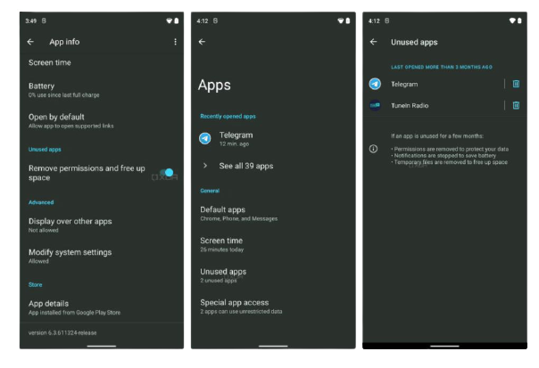
Android 12 has gone the extra mile. This includes two new quick-setting tiles that let you disable the camera and microphone. IOS 15 doesn’t have that under the hood. In addition, there’s a new app hibernation feature in android 12 that stops apps from reclaiming memory and clears their cache if you don’t use them long enough.

Relaunching the app will bring them back out of hibernation. Whenever an app requests to access your location, you’ll be able to allow it to use just an approximate one instead of a precise location. A good case scenario for this would be allowing a weather app to have your approximate location since it needs to know the city.
In contrast, an app like google maps will need a more precise location for GPS navigation whenever you copy or paste anything. A toast message will appear to let you know which app tried to access.
The clipboard keeps it transparent IOS 15 has something similar where apps won’t know what’s on your clipboard until you paste the content into the app and just like IOS 15.
Android 12 has a new privacy dashboard that shows you a timeline of every permission access and which app used them. Think of it as digital well-being for your privacy.
IOS 15 will provide a similar section called app privacy report. Still, it’ll only work if you have iCloud plus but on top of showing you what permissions were accessed during the last seven days.
It’ll also show you which of your apps have contacted other domains and how recently they contacted them. Those are most of the exclusive features that were released in Android 12 that IOS still doesn’t have.
There are other minor exclusive features, but I’d much rather move on and talk about the features that android 12 and IOS 15 copied from one another.
Starting with Android 12, two new gestures are complete rip-offs from IOS.
The first one is called one-handed mode. It brings down half the screen whenever you swipe down on the navbar. Just like on IOS, the second copy gesture called quick tap lets you launch a task or open an app just by double-tapping the back of the phone.
Android 12 also took inspiration from IOS’S orange and green indicators whenever the camera or microphone is used in the foreground or background for picture-in-picture mode. Android did it first, but IOS made it easier to resize the video by double-tapping or pinching in or out. Plus, they allowed you to hide the video off to the side instead of completely closing it.
Android 12 copied all of that when it comes to widgets. Android did it first back in 2009. IOS copied the same idea when they released IOS 14. Still, Apple did a much better job at making them look more uniform interactive. Modern they made stock android widgets look simple outdated, and inconsistent in terms of design.
With Android 12, Google wants to improve its widgets by changing the design, making them a lot more animated and giving us more options. The widgets haven’t been released yet, but I was impressed after seeing them within the google video. I feel like apple forced google to improve its current collection when it comes to IOS 15 copying android features.
They also have a few safaris. For example, I copied three features from google chrome. The first one is that you can swipe on the bottom address bar to switch between tabs. Google Chrome has had this for years. Safari also picked up on chrome’s grid tab view. I mean, it’s way better than what they had before.
So I don’t blame them, and you can create tab groups to categorize or group any related tabs you opened. It just makes life easier, but chrome has had this for a while now. Good old Siri also got some ideas from google assistant in IOS 15.
Siri no longer needs an internet connection to respond to some of your requests. This includes asking to deal with timers alarms opening apps toggling settings controlling audio playback. More, it can’t answer every command offline, especially when it’s a technical question.
Still, it’s good enough. Siri is also picking up on google assistant’s ability to continue the conversation by referring to what you previously asked.
Who was the president of the united states? Joe Biden is the president of the united states. How tall is he?
Joe Biden is six feet tall. Who’s his wife? Joe Biden is married to Jill Biden. IOS 15 has also introduced a new feature called live text, which recognizes any text or handwriting within the photo screenshot or lives preview within the camera app. You can copy the words to your clipboard.
It’s the same feature found within google lens in the text tab. Still, google lens takes it a step further by automatically translating any text without needing to highlight it. You can also have it solve any math equation and a lot more.
Finally, when it comes to Facetime, I was surprised that google duo had already implemented most of the new features that apple just released with ios 15.
For example, Facetime now lets you share your screen with others. Google duo already lets you do that Facetime. Now has a portrait mode to blur the background to keep the main subject in focus google duo.
Let’s you do that. The only thing I’m excited about is that Facetime finally opened up its doors to let android and Windows users join in on the fun overall. I’m impressed with both updates.
I feel like android 12 is making bigger changes than IOS 15, but it fluctuated every year last year. IOS 14 was a much bigger update than android 11 since they included widgets. It provided more customization options to the home screen. This year it’s flip-flopped if you’re interested in trying out either of these updates on a supported iPhone or Android.
